The risk map that arrives before the rain
Chuvarada covers 28,483 Brazilian neighborhoods with real-time hydrological data — so evacuation happens before, not after.
The problem
The alert exists. The granularity doesn't.
Brazil has weather alert systems. What it lacks is neighborhood-level precision: Defesa Civil alerts are issued per municipality — and someone living on a hillside in Recife doesn't know if the risk is on their street or three neighborhoods away.
What exists
CEMADEN issues municipal alerts. Defesa Civil makes regional announcements. gov.br centralizes data but doesn't translate it for people on the ground.
What's missing
Neighborhood-level granularity, in real time, accessible to anyone on a mobile phone — no login, no installation, no technical jargon.
neighborhoods covered
With risk scores recalculated every hour using six public data sources.
Product principle
If the georeferenced point is wrong, the risk score is wrong too — and a wrong alert is worse than no alert.
The technical challenge (that became a product decision)
Brazil has no neighborhood centroids
The problem wasn't missing data — it was incompatible data. Brazil organizes its administration by districts, not neighborhoods. The IBGE 2022 Census mapped neighborhoods but without centroids for geocoding.
Without a centroid, there's no reliable way to associate a geographic point with a neighborhood. The standard solution (geometric center of the polygon) would place the representative point in uninhabited areas — hills, rivers, vacant land.
The solution
Population-weighted centroid using IBGE 2022 Census data. Each neighborhood's representative point falls where people actually live, not at the geometric center of the polygon.
Why this matters for the product
If the georeferenced point is wrong, the risk score for that neighborhood is also wrong. This was a product decision disguised as a technical problem — and the most important one in the project.
The solution
Six sources. Seven variables. One number per neighborhood.
Chuvarada combines six free public data sources, updated automatically, to calculate each neighborhood's risk every hour.
| Source | Provider | What it delivers |
|---|---|---|
| MERGE/CPTEC | INPE | Satellite + rain gauge precipitation |
| Open-Meteo | Open-Meteo | Wind, humidity, pressure, hourly rain, soil moisture |
| NASA SRTM | NASA | Terrain elevation (~30m resolution) |
| ANA/BHO | National Water Agency | National hydrographic network |
| IBGE 2022 Census | IBGE | Neighborhood mesh for all of Brazil |
| TideCheck | UHSLC / FES2022 | Real tide level (113 of 115 coastal cities) |
How the score is calculated
The seven variables are combined with weights defined by each one's relevance to flood risk:
| Variable | Weight |
|---|---|
| Rain peak (3h) | 22% |
| 72h rainfall | 16% |
| Last-hour rainfall | 15% |
| Terrain slope | 14% |
| Soil moisture | 14% |
| Water proximity | 11% |
| Tide | 8% |
Result
Score of 1 to 10, recalculated hourly, translated into five levels: Normal / Watch / Moderate / High / Critical.
Automatic Critical escalation rules
- i. More than 50mm of rain in the last hour
- ii. Tide above 80% combined with rain in a coastal area
The interface
From the model to a map anyone can read
The model returns a number. The interface's job is to make that number legible for someone on a hillside, on their phone, with no login and no jargon — and to communicate not just the risk, but why.
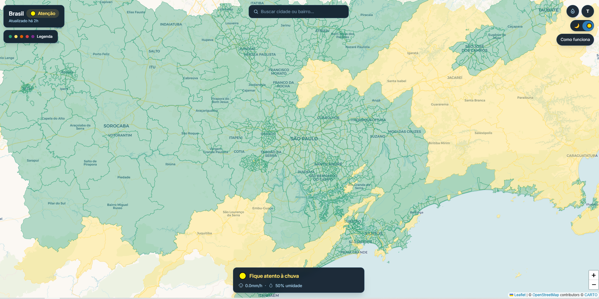
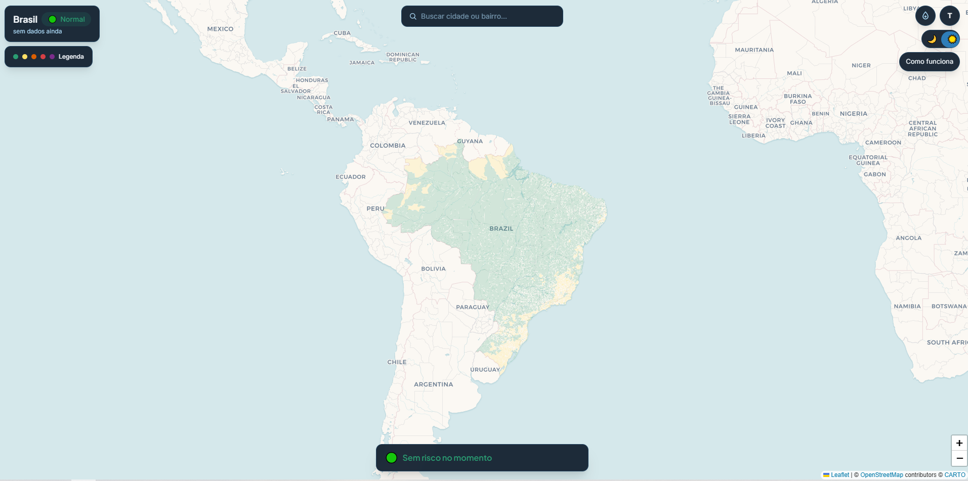
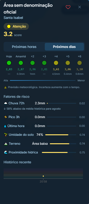
The neighborhood card is where design and model meet. Instead of hiding the calculation, it exposes each risk factor with the weight it carried in the score — soil moisture, terrain, water proximity, rain — and translates the raw data into interpretable language ("58% below the historical average for August"). Showing the reasoning, instead of handing over only the verdict, is what builds trust in whoever decides to evacuate.
Score + five levels
Number (1–10) and color together: legible for those who read by color and those who compare by value.
Timeline with uncertainty
Coming hours and days — and the interface warns that the forecast loses precision over time.
Transparent factors
Each model variable appears with its contribution. The weight stops being a technical detail and becomes information for the user.
Favorite the neighborhood
Follow where you live, or where your family is, with no account — the essentials on the phone, when it matters.
How it was built
Six sources, one score per hour, an app with no store
A nationwide product, built and maintained by one person. What makes it possible is a lean architecture and AI-assisted development.
Stack
Next.js + TypeScript and Tailwind on the front end; Leaflet.js for cartography; Supabase as the database; continuous deploy on Vercel; installable PWA.
Pipeline
Every hour, the six public sources are consolidated and the weighted model recalculates the risk score for all 28,483 neighborhoods.
Method — Spec-Driven Development with AI
Built solo with Spec-Driven Development and Claude Code: the spec comes before the code, and AI speeds up implementation without taking the design and product decisions out of my hands. That's what lets one person ship — and maintain — a product this size.
Product decisions
What I left out — and why
Documenting what was cut, and why, is what holds each of the model's choices together.
Numeric scale, not traffic lights
Red/yellow/green collapses nuance. A score of 4.8 and one of 7.2 look identical on a traffic light but represent completely different risks. The 1–10 scale communicates trends and enables historical comparison.
Soil moisture as a variable (14%)
It's the most counterintuitive variable — and the most important in many scenarios. Light rain on saturated soil generates more flooding than heavy rain on dry soil. Dropping it for being hard to explain would trade precision for simplicity.
Neighborhood, not municipality
Municipal granularity already exists and doesn't solve the problem. The product only makes sense if the answer is more precise than what already exists. Neighborhood-level detail is the value proposition — without it, there's no product.
Community reports as validation, not primary source
Satellite data is accurate at scale; human reports are accurate locally. The model detects the event; the report confirms where it's impacting. Inverting this hierarchy would make the system easy to manipulate.
Honest limitations published on the platform
No urban drainage data (doesn't exist as public data in Brazil). Weights without formal regional calibration. São Paulo, Campinas and Sorocaba covered by districts, not neighborhoods. Publishing limitations doesn't weaken the product — it increases trust from decision-makers who rely on it.
Results
In production. Open source.
Coverage
28,483 neighborhoods covered
Updates
Score recalculated every hour
Data
6 public data sources integrated
Platform
Installable PWA — works like an app, no store
Access the project
Articles published on Substack (PT) and Medium (EN).
Takeaway
Real-time data without product decisions is noise. Every model variable exists because there's a real user question behind it — “is my neighborhood at risk right now?” — and the answer needs to arrive before the question becomes too urgent.
The project's hardest technical problem (neighborhood centroids) was actually a product problem. If the geographic point is wrong, the score is wrong — and a wrong alert is worse than no alert.